Construction grid & ratios
Every mark starts on a real grid — a baseline of circles, squares, and golden-ratio proportions that gives the logo geometry you can defend and reproduce at any size.
 Let's talk!
Visual Identity & Logo Design
Visual identity is the system that makes a brand instantly recognisable — the logomark and its construction grid, the typography, the colour, and the asset kit that holds the line from an app icon to a building sign. MarkAge360 designs identities from the geometry up: a mark built on a real grid, a type and colour system with rules behind it, and a toolkit your team can apply across every touchpoint without it ever drifting.
Identity approach
A logo is not a sketch — it is geometry with intent. We start on a construction grid, draw the mark from circles and ratios, resolve it into responsive lockups, set the type and colour with rules behind every choice, then prove it across the touchpoints it has to live on. Grid, mark, system, specimen, and application run as one build — so the identity holds together everywhere it shows up.
Every mark starts on a real grid — a baseline of circles, squares, and golden-ratio proportions that gives the logo geometry you can defend and reproduce at any size.
We draw the mark directly off that scaffolding — the curves snap to the construction circles, the angles to the grid — so the final logomark feels inevitable rather than decorated.
The mark resolves into a full lockup family — primary, stacked, horizontal, and a stripped favicon — each tuned to stay legible from a billboard down to a 16-pixel tab.
We set the colour palette and the typographic system with rules behind every choice — primary and supporting tones, type scale, and pairings — so the look is a system, not a single screen.
Finally we prove it in the wild — app icon, business card, signage, and web — and the colour paints in across the kit, so you can see the identity holding the line everywhere it lives.
Selected work
Logomark, typography, colour, and the asset kit stay connected while the identity work scrolls past — built from the grid up, proven across every touchpoint.
We review the current marks, competitor visuals, and the contexts the identity has to perform in, then set the design brief and territories.
The mark drawn on a real grid — golden-ratio geometry, clear space, and minimum sizes — so it reproduces cleanly at any scale.
Typeface selection and pairing, a full type scale, and a primary plus supporting colour palette with usage and accessibility rules.
Responsive lockups, favicon and app-icon variants, patterns, and the iconography that lets the identity flex without losing itself.
The identity proven across touchpoints, packaged with usage guidance and production-ready files so any team can apply it correctly.
 Infrastructure · B2B
Encardio Rite
Encardio Rite had decades of geotechnical engineering authority the internet could barely see. MarkAge360 built an integrated SEO, content and executive-branding system that grew monthly organic traffic from around 800 to as many as 70,000, with page-one visibility across five markets: India, the USA, the UK, the UAE and Australia.
 Consumer · Brand campaign
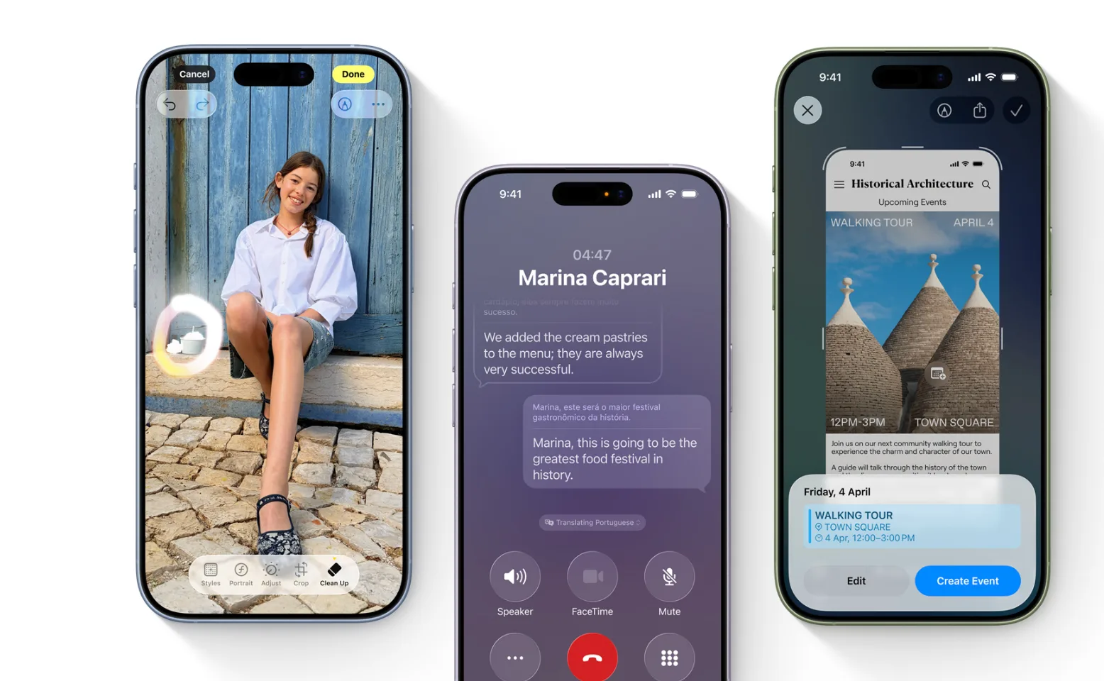
Apple Switchers Campaign
Apple wanted non-Apple users across India's metros to reconsider iPhone. MarkAge360 ran a video-led brand campaign that showed what the Apple experience offers and how easy switching can be.
 Automotive Marketing
Acton Service Centre
Five years running every marketing channel for a West London MOT and service garage, and building the software behind it. Organic traffic up 2,400%, revenue up 900%, and a first party customer database past 100,000.
 Legal · Solicitors
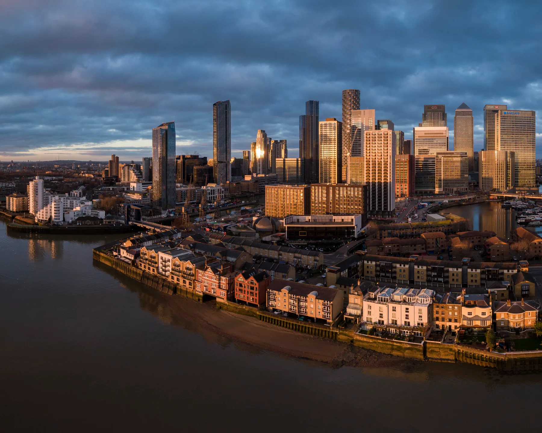
Clifford Harris & Co
Clifford Harris & Co has advised businesses and families from London's West End since 1957, but its digital presence did not carry that standing. MarkAge360 rebuilt the firm online: a sharper brand expression, a website organised around how clients actually choose a solicitor, and search foundations written into every practice area.
 Commercial · Tile Retail
Ferreira's
Ferreira's sells luxury Italian porcelain from a showroom on West End Lane in West Hampstead, and designs, supplies and fits it too. We ran their marketing as one system for two years: identity, a bathroom-led catalogue, search, and paid media built around a product people research for months and buy in person.
 Higher Education
Institut Français India
MarkAge360's demand-generation system for Institut Français India: paid media, education affiliates, and lifecycle messaging run as one connected student-acquisition engine. It beat the Choose France lead target by 47% and returned an 8:1 ROI, with ₹8 back for every ₹1 spent.
 Wellness · Subscription
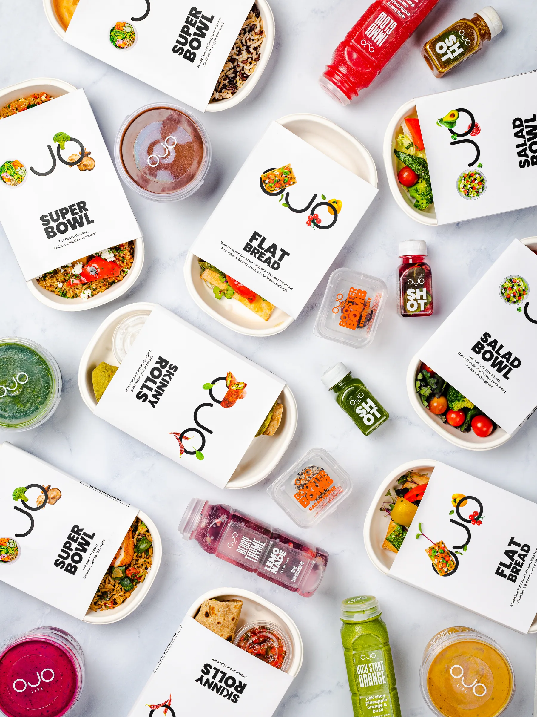
OJO Life
OJO Life is a Delhi NCR wellness and meal-subscription brand that had spent two years stuck against its revenue ceiling. MarkAge360 built one connected wellness marketing growth system.
 Higher Education
Study in India · GMAC
GMAC's first mandate to MarkAge360: a 90-day, 00,000 global campaign to move prospective students across 40+ countries.
 Higher Education / Test Prep
The GMAT Exam by GMAC
Seven years, four regional mandates, 400,000+ leads across 20+ countries — work that began at King Crescent and moved to MarkAge360 at founding. What began as a one-year Middle East & Africa test grew into GMAC’s four-region growth partnership, every expansion earned on delivered numbers.
 Education / Test Prep
Aakash iACST
Aakash's iACST is an always-on scholarship test. The mandate: hit the lead target for the August flight and cut cost at every stage. MarkAge360 delivered a 12% lead-to-conversion rate, with cost per lead down 15% and cost per conversion down 28%.
 Education / Study Abroad
TOEFL Olympiad
A two-phase, full-funnel campaign that introduced the TOEFL Olympiad to India's Gen Z — turning study-abroad ambition into reach, a qualified database, and registrations that cleared every target set.
 Geotechnical · B2B
Rite Geosystems
Rite Geosystems had deep expertise in geotechnical instrumentation and infrastructure monitoring that the US market could barely find online. MarkAge360 built an integrated system across US-focused SEO, engineering content, website optimisation and social media, making the brand discoverable for the products, applications and engineering problems central to its market.
01 / 12 · identity work
View caseTools we design identities in
Related brand services
Brand projects usually touch more than one branch. These sibling pages keep the service architecture connected without forcing every detail into one long page.
Visual Identity & Logo Design FAQ
Straight answers on what an identity includes, how it’s priced and scheduled, and how we keep your brand recognisable across every touchpoint.
A logo is a single mark; a visual identity is the whole system that makes a brand recognisable everywhere it appears. At MarkAge360 an identity includes the logomark and its construction grid, a full lockup family (primary, stacked, horizontal, and favicon), a colour palette, a typographic system, and the rules that hold them together. We design the mark first, then build the system around it so the look survives an app icon, a billboard, and a 16-pixel browser tab.
We price by scope, not by a flat “logo fee.” A single logomark with core lockups sits at the lower end; a complete identity with colour, type, an asset kit, and application across touchpoints is a larger engagement. After a short discovery call we send a fixed-scope proposal so you know the deliverables, the number of design directions, and the cost before we start — no open-ended hourly surprises.
A focused logo and core lockup set typically takes a few weeks; a full identity system with colour, type, and an applied asset kit usually runs longer because each stage builds on a signed-off prior one. We work in clear phases — grid and mark, then system, then specimen, then application — with a review at each gate. Your timeline depends mostly on how quickly feedback comes back, so we set the review schedule up front.
A generated or one-off logo gives you a single picture; it rarely gives you a system that holds up at scale. We draw the mark on a real construction grid so it reproduces cleanly at any size, then deliver the lockups, colour, type, and usage rules a generator skips. The result is an identity your team can apply across web, print, packaging, and signage without it drifting — and source files you actually own.
You get editable vector source (typically Figma and/or SVG), plus production-ready exports in SVG, PNG, and PDF for the full lockup family, a favicon, and clear-space and minimum-size rules. We provide light and dark variants and the colour values in HEX, RGB, and CMYK so the identity is correct on screen and in print. Everything ships with a short usage guide so anyone on your team can apply it correctly.
Consistency is built into the system, not left to chance. We define clear-space, minimum sizes, colour rules, and approved type pairings, then prove the identity against real touchpoints — app icon, business card, signage, and web — before we hand it over. If you need it enforced at scale, we can extend the work into full brand guidelines and design systems so every team applies the brand the same way.
Tell us the business problem. We'll map the service mix and come back with a written proposal.